User Research Report: Making Policy Research Accessible
User Research Report: Making Policy Research Accessible
 PROJECT LINKPROJECT LINK
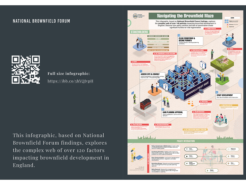
Government policy research reports have a reputation problem—they're often dense, text-heavy documents that sit unread on shelves. The National Brownfield Forum had conducted extensive research on how over 120 different government policies interact to affect brownfield land development, but the findings needed to reach and influence busy stakeholders across government departments, regulatory agencies, and industry.
I analysed workshop findings and notes, prepared the report content, created infographics, designed the layout, and collaborated with the project team to transform complex policy research into something people would actually read and act on.
The research revealed a maze of interconnected policies affecting brownfield development—planning regulations, environmental permits, waste management rules, biodiversity requirements—all owned by different government departments with little coordination. The findings were important but complex, and traditional academic report formatting would have buried the insights.
Instead of starting with dense text, I led with visual infographics that immediately showed the scale of the problem. The opening pages use clear, digestible insights with supporting graphics rather than paragraphs of methodology.
I restructured the content to lead with findings rather than process. Key insights appear as highlighted callouts throughout, so busy readers can scan and understand the main points without reading every word.
The design needed to feel authoritative for government audiences while being visually engaging enough to hold attention. I used clean typography, strategic color coding, and plenty of white space to make dense information more approachable.
The report successfully communicated complex policy interactions to diverse stakeholders across government and industry. The visual approach made findings immediately accessible, with key insights scannable for time-pressed readers while detailed analysis remained available for those who needed it.
The infographic showing the "brownfield policy maze" became a standalone communication tool used beyond the report itself, effectively illustrating the complexity challenge facing developers and regulators.
Visual hierarchy is crucial for policy communication. Dense research findings need clear information architecture—leading with insights, supporting with detail, and making key points immediately scannable.
Stakeholder context matters for design decisions. Government and industry audiences expect professional presentation but respond well to clear visual communication that respects their time constraints.
Infographics can carry complex messages. Sometimes a single visual can communicate what pages of text struggle to convey, particularly when dealing with interconnected systems and processes.
This project showed how thoughtful information design can bridge the gap between valuable research and actionable policy insights, ensuring important findings actually influence the decisions they're meant to inform. This report demonstrated how design thinking can make government policy research more accessible and actionable for diverse stakeholder audiences.


Created a visual workflow representation that clearly communicates the complex Spatial Data Delivery Service (SDDS) process.
This case study demonstrates how user-centered design, rapid prototyping, and modern development tools can transform complex environmental data into accessible, actionable insights for diverse user groups.
The offshore wind industry needed a simplified, accessible tool to compare geological features for foundation siting decisions. Existing geological assessment data was locked in complex Excel spreadsheets, making it difficult for wind farm developers to quickly evaluate and compare site conditions across different geological environments.
Transforming dense policy research into engaging, actionable insights for government stakeholders and industry professionals