BGS had 200+ environmental sensors across 4 research sites pumping out valuable data, but nobody could easily access or understand it. Researchers struggled with complex APIs, the 3D team couldn't embed sensor data into their applications, and project teams had no way to test what data was coming from which sensors.
I led UX design on this project—user research, requirements gathering, design, and prototyping. Working with BGS researchers, the 3D visualisation team, and developers to build something that actually worked for everyone.
I identified three user groups with very different needs:
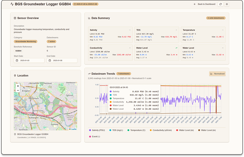
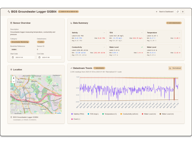
Researchers needed to quickly see what was happening across their sensor network and spot patterns in the data.
3D Visualization Team wanted to embed live sensor data into immersive 3D environments.
Project Teams needed to test APIs and validate what data each sensor was returning.
Instead of starting with detailed views, I designed a comprehensive overview that gives context before diving deep.
The breakthrough was normalising different measurement types (temperature, pressure, gas levels) to a 0-1 scale so researchers could compare across sensor types. Users can toggle between normalised and raw data views.
Built the entire system as independent components that could work alone or together, enabling the 3D team to embed pieces wherever they needed. Each sensor and related datastreams have a unique URL which can be embedded in other applications.
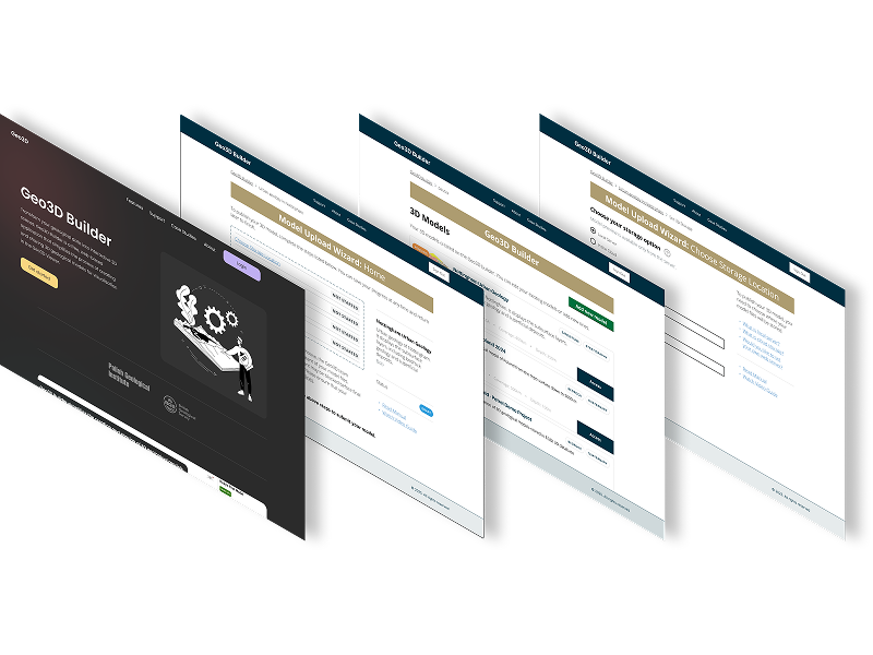
Started with Figma mockups using shadcn/ui components, then built a functional prototype with Claude Code and Better T-Stack.
Optimised for the most common use case—viewing recent data—with 500 latest readings as the default for fast load times.
Building a functional prototype with real data early revealed user needs and technical constraints that would have surfaced much later. The dashboard transformed how researchers interact with environmental sensor data, enabling both traditional analysis and new 3D visualisation possibilities.


Created a visual workflow representation that clearly communicates the complex Spatial Data Delivery Service (SDDS) process.
This case study demonstrates how user-centered design, rapid prototyping, and modern development tools can transform complex environmental data into accessible, actionable insights for diverse user groups.
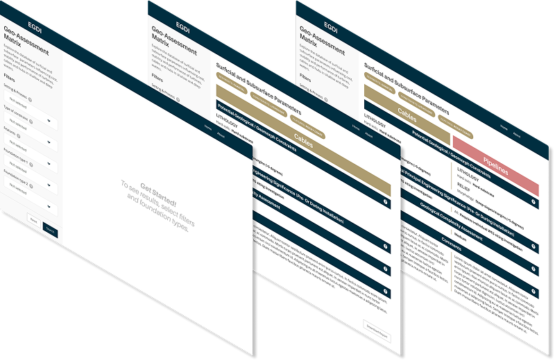
The offshore wind industry needed a simplified, accessible tool to compare geological features for foundation siting decisions. Existing geological assessment data was locked in complex Excel spreadsheets, making it difficult for wind farm developers to quickly evaluate and compare site conditions across different geological environments.
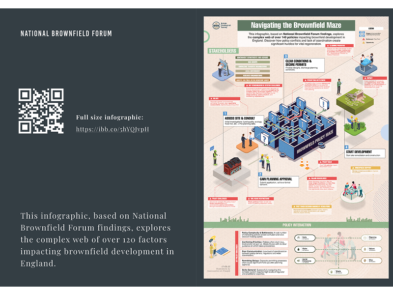
Transforming dense policy research into engaging, actionable insights for government stakeholders and industry professionals